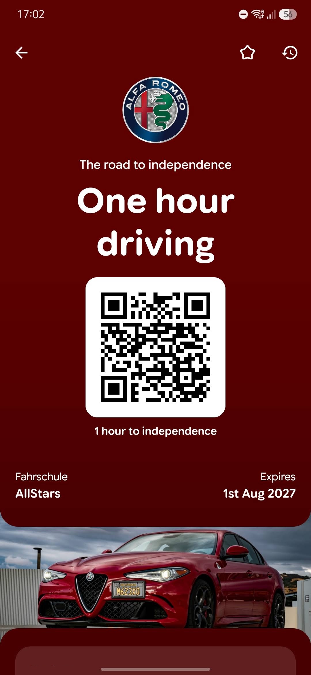
Open a loyalty card in Google Wallet today and the pass owns the phone. Brand colour floods the entire screen, the on-screen controls tint themselves to match, the logo sits near the top in a big circular frame, and the hero image runs full width. This is the August 2026 redesign, and it is the upgrade Google's pass presentation has really needed.
The overflow menu is gone
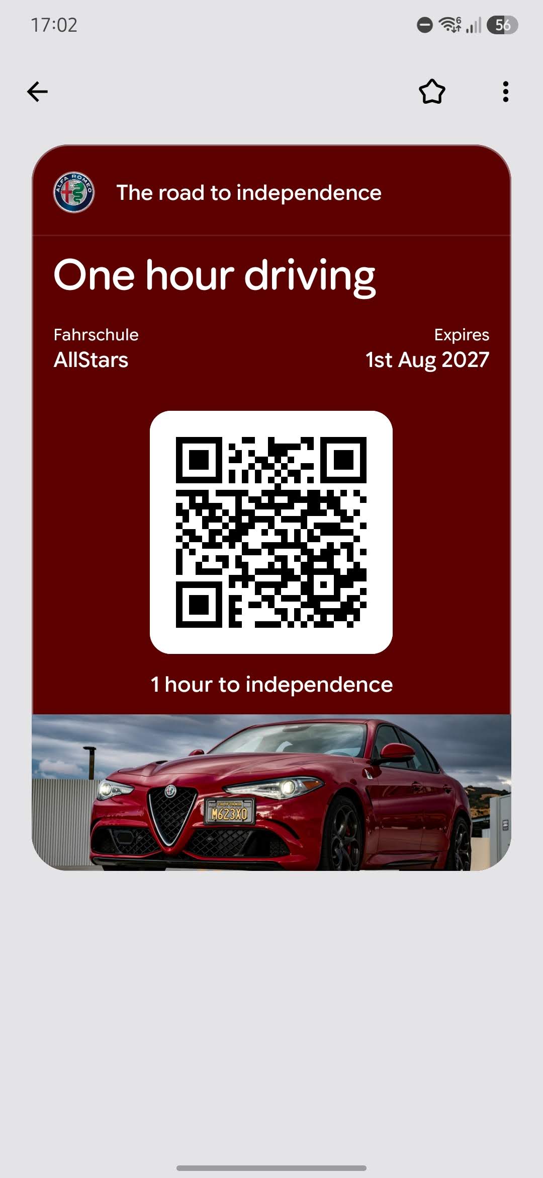
The detail view is now vertically structured, and scrolling down surfaces what used to be hidden: quick actions like calling a phone number or opening a website, plus a settings section for nicknames and pass usage preferences. All of that previously lived behind a three-dot overflow menu. A rewind icon in the top-right corner flips back to the old layout for the nostalgic (any out there?), but only temporarily; the choice does not persist.
Dates, versions, coverage
The rollout started on 18 August 2026 with Google Wallet version 26.32.962917069. By early September it was in wide release on Android. Loyalty cards and boarding passes get the new look, manually created ones included.
You have to do exactly nothing
Nothing on the issuing side changes. Pass data, barcodes, and validity are untouched, and existing passes pick up the new rendering as the rollout reaches each device. Passes issued through PassIssuer display in the new style with no reissue and no API changes.
Four fields just got promoted
Fields that used to be cosmetic now do structural work. Go pull up your live templates and check them against this list:
- Background colour. It used to tint a small card; now it paints the whole screen and every control on it.
- Logo. It lives in a circle now. A square or round mark survives the crop. A wide wordmark loses its edges.
- Hero image. It renders full width.
- Content hierarchy. The vertical layout gives every field room.
The excuse is gone
Apple Wallet set the bar for pass presentation years ago, and the standard advice was to design for iOS and tolerate Android. That advice is no longer valid. If you want a second pair of eyes on how your templates survive the new layout, talk to us at PassIssuer.
Frequently asked questions
Do I need to reissue my Google Wallet passes after the August 2026 redesign?
No. The redesign changes only how passes are presented in the Google Wallet app. Existing passes, barcodes, and pass data remain valid and pick up the new layout automatically.
Which pass types use the new Google Wallet design?
The full-screen design applies to loyalty cards and boarding passes, and generic passes including manually created ones.
Can users switch back to the old Google Wallet pass design?
Partially. A rewind icon in the top-right corner of a pass temporarily shows the old layout, but the setting does not persist, and the full-screen design remains the default.
What happens if a Google Wallet pass has no background colour set?
Google derives a background colour automatically from the pass logo. Because that colour now fills the entire screen, it is better to set the colour explicitly so the result matches your brand.